Bemærk
Adgang til denne side kræver godkendelse. Du kan prøve at logge på eller ændre mapper.
Adgang til denne side kræver godkendelse. Du kan prøve at ændre mapper.
This article explains how to customize the editable grid control in Power Apps to meet specialized visual and interaction requirements. Use the Power Apps grid control extensibility APIs to build a grid customizer code component with custom cell renderers and editors.

Grid customizer control
A grid customizer is a PCF control that implements the Power Apps grid control customizer interface. This interface allows you to define the React element that renders when a grid cell is in read-only mode (the cell renderer) or in edit mode (the cell editor). Multiple grid customizer controls can exist in an environment, but each grid can only have a single grid customizer control assigned. You might decide that a separate customizer control is needed for each grid you want to modify, or you might choose to reuse the same customizer control for multiple grids.
Implement a grid customizer control
To implement a grid customizer control, you first need to be familiar with the steps to Create and build a code component and you must have access to the template control.
The template control is included in the PowerApps-Samples GitHub repository. You need to clone or download the repo to access the files located here: PowerApps-Samples/component-framework/resources/GridCustomizerControlTemplate
Open the
GridCustomizerControlTemplatefolder using Visual Studio Code.In a terminal window, run
npm install.Create your custom cell renderers and editors.
The customization code is in the customizers folder.
CellRendererOverrides.tsxincludes cell renderer customizers per data type.CellEditorOverrides.tsxincludes cell editor customizers per data type.
Modify these files to add react elements to render when a cell is in read-only (cell renderer) or in edit (cell editor) mode.
Each file exports an object mapping the column data type to a function returning a react element to render inside the cells for that column type.
/**
 * Provide cell renderer overrides per column data type.
*/
 export interface CellRendererOverrides {
   [dataType: string]: (props: CellRendererProps, rendererParams: GetRendererParams)
   => React.ReactElement | null | undefined;
};

/**
 * Provide cell editor overrides per column data type.
*/
 export interface CellEditorOverrides {
   [dataType: string]: (defaultProps: CellEditorProps, rendererParams: GetEditorParams)
   => React.ReactElement | null | undefined;
};
Note
If the function returns null or undefined, the grid uses the internal renderer or editor for the targeted cells.
After defining your custom cell renderers and editors, package the grid customizer control and import it to your Power Apps environment. Alternatively, use the pac pcf push command.
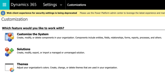
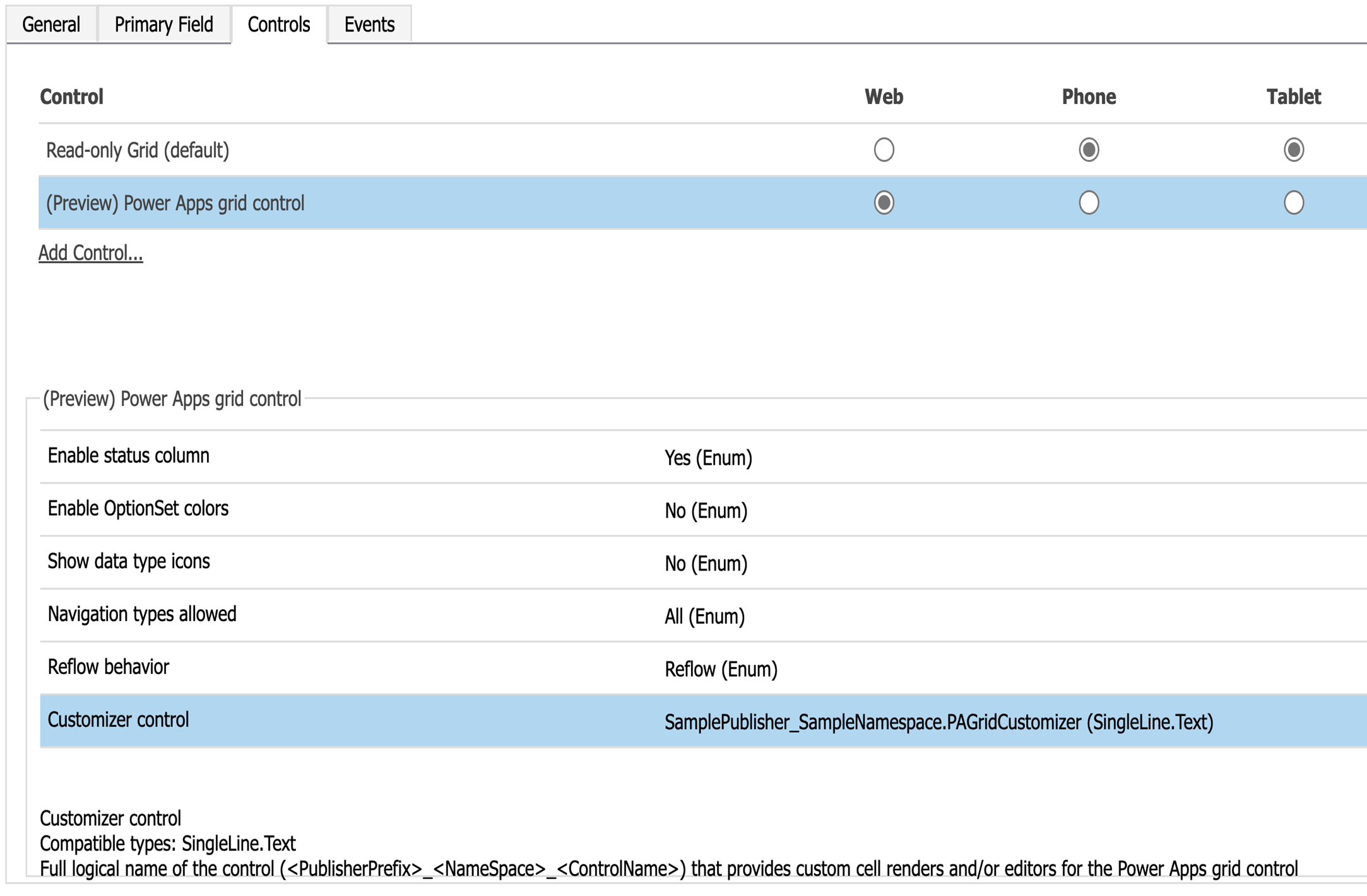
After publishing the grid customizer control, open the Customize the system panel from the Settings > Customizations menu.
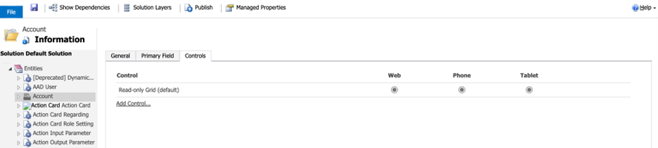
From the entities node, select an entity that your customizer control targets (for example, Account).
From the right panel, select the Controls tab.
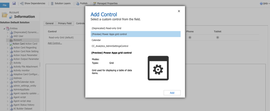
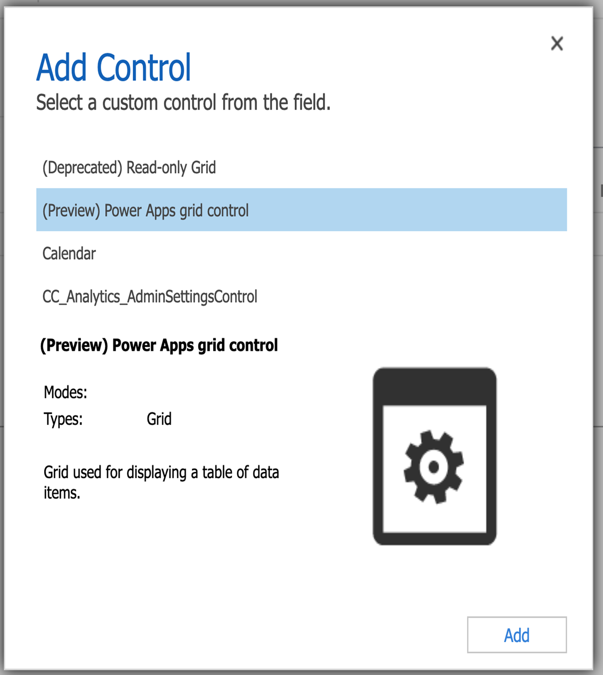
From the Controls list, add the Power Apps grid control.
In the Properties panel, set the Customizer control property to the full logical name of your grid customizer code component.
Full logical name =
{publisher prefix}_{namespace}.{control name}
Save and publish your customizations for this entity.
Test your customizer by opening the main grid for the customized entity.
Repeat steps 6-11 for any other entities whose grid needs a grid customizer control.
Best practices
- Cell renderers and editors are user interface components. Don't use them to mutate data or metadata of the grid.
- The customizer controls should be lightweight and fast so they don't affect overall grid performance.
- To maintain the design consistency, follow Fluent design principles and use Fluent controls in your customizers.
- Ensure your custom renderer or editor is accessible.
- The customizer function should be pure since the grid calls it multiple times to get customized elements and expects the return value to be consistent.
- The grid might dispose a customizer element at any time and call to get a new one at any time. Ensure to dispose of any internal state on unmount to prevent memory leaks.
- Don't use renderers to override the values in the grid since the server doesn't use the new values to do filtering or sorting.
Example
You can find an example of a customized editable grid control here: Customized editable grid.
See also
Power Apps component framework overview
Create your first code component
Learn Power Apps component framework