Microsoft Teams | Development
Building, integrating, or customizing apps and workflows within Microsoft Teams using developer tools and APIs

This browser is no longer supported.
Upgrade to Microsoft Edge to take advantage of the latest features, security updates, and technical support.
' cx='32' cy='32' r='32' /%3E%3Ctext x='50%25' y='55%25' dominant-baseline='middle' text-anchor='middle' fill='%23FFF' %3EJL%3C/text%3E%3C/svg%3E)
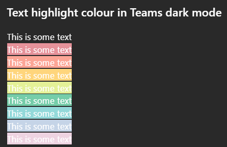
All highlighted text in Teams has poor colour contrast when in Dark mode on desktop. While some may be readable, none of the highlight colour options meet WCAG colour contrast minimums and so are inaccessible to users.
Go to MS teams app on Win 11 and set appearance to dark mode.
Create any default coloured text (this is white in dark mode) and apply any text highlight colour
The result is inaccessible: it does not meet WCAG colour contrast thresholds and is very hard to read.
On mobile (android MS Teams app) - the text colour changes to black which does meet the colour contrast minimum.
This behaviour (illegible white text) on light backgrounds is also found on high contrast mode.
This is different behaviour from MS word, which meets colour contrast minimum in a different way. Here highlight colours in dark mode are adjusted (e.g. the background highlight ffff00 --> is shifted to 393900 when dark mode is selected), and the text colour remains unchanged so there is enough contrast between the highlight and the white text colour.
This needs a fix in make this accessible to users in dark mode so content can be read if another user has highlighted text.
I'm not sure if this is the right place to post this but I was unable to register my MS account on the https://learn.microsoft.com/en-gb/answers/
Building, integrating, or customizing apps and workflows within Microsoft Teams using developer tools and APIs
' cx='32' cy='32' r='32' /%3E%3Ctext x='50%25' y='55%25' dominant-baseline='middle' text-anchor='middle' fill='%23FFF' %3EKN%3C/text%3E%3C/svg%3E)
Hi Joshua,
Regarding the behavior you've observed in Microsoft Teams Desktop, the highlighted text in Dark Mode currently does not adjust sufficiently to maintain accessible color contrast across the available highlight colors. As a result, certain combinations of white text and light highlight backgrounds can be difficult to read and may not meet WCAG color contrast requirements.
I appreciate the thorough comparison you've made with the Android Teams app and Microsoft Word, where different approaches are used to preserve readability in Dark Mode. Feedback such as yours helps highlight the impact this behavior can have on users who rely on accessible contrast levels when working with highlighted content.
As Independent Advisor, I unfortunately don’t have the ability to change or enable features directly within Microsoft Lists. However, I strongly encourage you to submit this suggestion through the Microsoft 365 Feedback Hub. This is the best way to ensure your request reaches the engineering team, who reviews user feedback to prioritize future enhancements.
Once you've submitted your feedback, feel free to share the link here in the comments. I’ll be happy to upvote it to help bring more visibility.
Additionally, since many other users have expressed similar concerns but may not know where to submit feedback, if my response has helped you better understand the situation and guided you toward a possible next step, please mark it this answer as "Yes". Your action will help pin this post to the top, making it easier for others in the community who are experiencing the same issue to find your feedback and support it.
Thank you again for your time and for raising this important usability concern.
Note: Please follow the steps in forum documentation to enable e-mail notifications if you want to receive the related email notification for this thread.
Hi Killian
Thanks for your helpful, good suggestion and fast reply!
I've tried to post to the Feedback site as you suggest but get a "You do not have the correct permissions to perform this action" (tried under various different accounts, browsers and machines - it looks like others have had hit this stumbling block). I'm not sure what the issue is, but I had a similar issue originally trying to register on this learn space too.
I've marked your suggestion as solved as I appreciate this isn't the right place for these bug reports.
Feel free to post the original submission on my behalf to the Feedback site.
Best,
Josh
Hi Joshua,
I appreciate you taking the time to try submitting the feedback and I'm sorry to hear you're running into the permissions error on the Feedback site.
Thank you as well for marking the thread as solved. I understand that this is not the ideal experience, and I appreciate your understanding.
Since you're unable to access the Feedback portal, I'll be happy to submit the feedback on your behalf and ensure that the original details of your suggestion are captured for the relevant product team to review. While I can't guarantee a specific outcome, submitting it through the official feedback channel helps ensure it is visible to the engineers responsible for the product.
Thank you again for your valuable suggestion and for bringing the Feedback site issue to our attention. Your input is greatly appreciated and helps improve the experience for everyone.
Best regards,
Hi Killian
Thanks for your helpful, good suggestion and fast reply!
I've tried to post to the Feedback site as you suggest but get a "You do not have the correct permissions to perform this action" (tried under various different accounts, browsers and machines - it looks like others have had hit this stumbling block). I'm not sure what the issue is, but I had a similar issue originally trying to register on this learn space too.
Feel free to post on my behalf.
Best,
Josh