Note
Access to this page requires authorization. You can try signing in or changing directories.
Access to this page requires authorization. You can try changing directories.
A dashboard is a collection of tiles, optionally organized in pages, where each tile has an underlying query and a visual representation. You can natively export Kusto Query Language (KQL) queries to a dashboard as visuals and later modify their underlying queries and visual formatting as needed. In addition to ease of data exploration, this fully integrated dashboard experience provides improved query and visualization performance. Copilot integration in the dashboard editing experience lets you use natural language to create and modify visuals directly, no KQL expertise required.
This article shows you how to create a new Real-Time Dashboard, add data sources, and add and edit tiles in the dashboard - manually or using Copilot. You also learn how to enable live refresh, use parameters, and export dashboards.
Important
Your data is secure. Microsoft-managed keys encrypt dashboards and dashboard-related metadata about users at rest.
Prerequisites
- A workspace with a Microsoft Fabric-enabled capacity
- A KQL database with data
Create a new dashboard
To create a new Real-Time dashboard, select the tab that corresponds with your desired creation method.
The Real-Time Dashboard exists within the context of a workspace. A new Real-Time dashboard is always associated with the workspace you're using when you create it.
Browse to the desired workspace.
Select + New item.
In the New item window, select Real-Time Dashboard. Search using the text box if needed.

On the New Real-Time Dashboard popup, enter a name and workspace location for the dashboard, and select Create.

A new dashboard is created in your workspace.


Complete dashboard setup by adding a data source to the dashboard. After the dashboard is connected to a data source, you can access all dashboard options like adding new tiles.


Add data source
Data sources are reusable references to a specific database in the same workspace as the Real-Time dashboard. Different tiles can be based on different data sources.
Select the tab that corresponds with your desired data source type.
Open your Real-Time dashboard.
In the upper toolbar, select Add data source > KQL Database.

In the OneLake Catalog window, select a KQL database to connect to your KQL queryset, and then select Connect.
Alternatively, close the OneLake Catalog window and use the + Add data source menu to connect to a different data source.


Edit mode
To switch to edit mode, select Editing in the upper-right corner.

Under the Home tab, you can add new visuals, markdown boxes, alerts, data sources, and parameters. You can also save and manually refresh the dashboard.

Under the Manage tab, you can manage parameters, base queries, configure Refresh setting, and manage data sources.

Add or edit tile
Dashboard tiles use Kusto Query Language (KQL) queries to fetch data and generate visuals. Each tile or query supports a single visual representation. The tile editor provides two options for authoring and editing a tile's query and visual:
Copilot (preview) - use natural language to generate the tile's KQL query and the tile visual. Copilot enables non-KQL experts, business analysts, and report creators who understand their data but aren't fluent to build dashboard visuals independently.
KQL query - manually author the query and define the tile visual.
You can switch between the two options at any time.
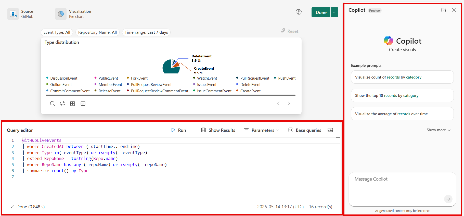
Describe the insight you're looking for. Start with a broad question and refine it based on the results. You might begin with "Show me all error events" and follow up with "Filter to critical errors only" or "Group by error type." Copilot maintains context within the conversation, so each follow-up builds on your previous requests. For more information, see Use Copilot for writing KQL queries.
In your dashboard, switch to Editing mode.
Select the visual type you want to create from the dashboard canvas or New visual from the top menu bar.

To edit an existing tile, select the pencil icon or open the tile options and select Edit.
In the Copilot pane, enter a description of the tile in natural language. For example, "Compare security screening lane volumes."

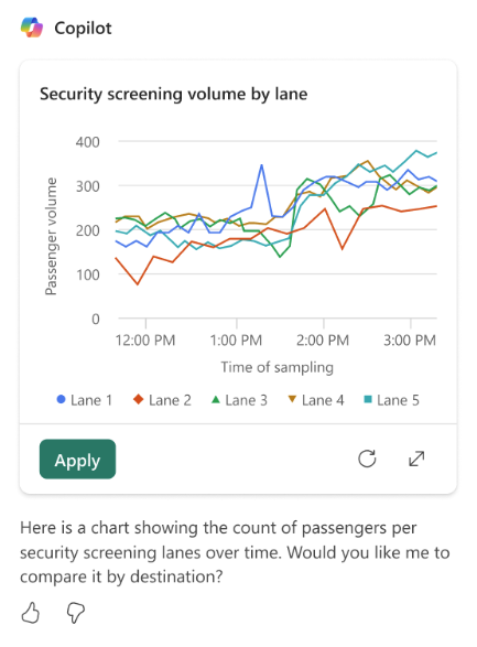
View the result. Refine the result by asking Copilot a follow-up request. In this example, ask Copilot to "Create a time chart comparing the top 5 security screening lanes."
In the Visual formatting tab, configure the remaining options.

For more information on how to customize the visual, see Customize Real-Time Dashboard visuals.
Select Apply. You can now view and edit the underlying KQL query or continue with Copilot. The query is generated based on your natural language description and any follow-up refinements you made in Copilot.
To add the tile to the dashboard, select Done.
In the dashboard toolbar, select the Save icon to save the dashboard with the new or edited visual.


Add tile from a queryset
You can add tiles to your dashboard directly from queries written in a KQL queryset.
Select Save to Dashboard.

Select the existing dashboard from the list of dashboards and then select Connect to create the tile.
Select Open dashboard from the pop-up message to view the new tile in the existing dashboard.
To give the tile a name, open the tile options and select Rename.


Add a Fabric Maps tile (preview)
Important
This feature is in preview.
Embed an existing Fabric Maps item as a tile in your dashboard. Unlike the built-in Map visual, which renders directly from a KQL query defined in the tile, a Fabric Maps tile embeds a pre-authored, multi-layer map item as-is. This approach lets you reuse the same map across dashboards without redefining its data sources, queries, or styling.
The embedded map is a self-contained visual: its data sources, queries, layers, and styling stay authored and maintained in the original map item, and any changes you make there appear automatically in the tile. In the dashboard, although you can't edit the map's settings, you can adjust the tile's layout position and size.
The map tile renders in map view mode, so viewers can pan, zoom, hover, select features, switch the basemap style, toggle layer visibility, and modify unlocked filters at runtime. Locked filters, set by the map's author, are always applied and can't be removed. Any changes a viewer makes are temporary and reset the next time the map is opened.
In your dashboard, switch to Editing mode. Your dashboard must already have a data source configured before you can add a tile.
Select New visual from the top menu bar, and then select Fabric Maps.

In the catalog picker, either:
- Select an existing map to embed it as-is, in its published state.
- Select Create a new map to open the map creation flow in a new browser tab. After you save the new map, return to your dashboard and select the new map from the catalog.
Adjust the tile's layout position and size as needed.
In the dashboard toolbar, select the Save icon to save the dashboard with the new tile.

Note
If the referenced map item is deleted, or if the dashboard is duplicated to a workspace where the map item doesn't exist, the tile shows an error state.
Add page
Pages are optional containers for tiles. Use pages to organize tiles into logical groups, such as by data source or by subject area. You can also use pages to create a dashboard with multiple views, such as a dashboard with a drillthrough from a summary page to a details page.
Select Editing in the upper-right corner to switch to editing mode.
On the Pages pane, select + Add page.

To name the page, select the vertical More menu [...] > Rename page.


Use parameters
Parameters significantly improve dashboard rendering performance, and enable you to use filter values as early as possible in the query. Filtering is enabled when you include the parameter in the query associated with your tiles. For more information about how to set up and use different kinds of parameters, see Use parameters in Real-Time Dashboards.
Tile legend
You can change the position of the legend in your tiles and use the legend to interact with the data.
Change the legend location
If you have edit rights on a real-time dashboard, you can change the location of the legend in your tile. Toggle to Edit mode and select the Edit pencil icon. In the Visual formatting pane, under Legend, select your location preference.
Interact with your data
Use the legend to interact with the data in your tile. Change what data you view by selecting the specific item in the legend. Use Ctrl to add or remove items from the selection, and hold Shift to select a range. Items you don't select are greyed out.
The Search button allows you to search and filter items.
Use the Invert button to invert your selection.
The Up and Down arrows navigate through the list in the following ways:
- When you select one item, the up and down arrows select the previous or next item.
- When you select more than one item, the up and down arrows scroll through the list of items. The data for any selected items you navigate to is highlighted.

View or edit query
You can view the query in either viewing or editing mode.
On the tile you want to explore, select the Tile options [...] > View query. A pane opens with the query and results table.
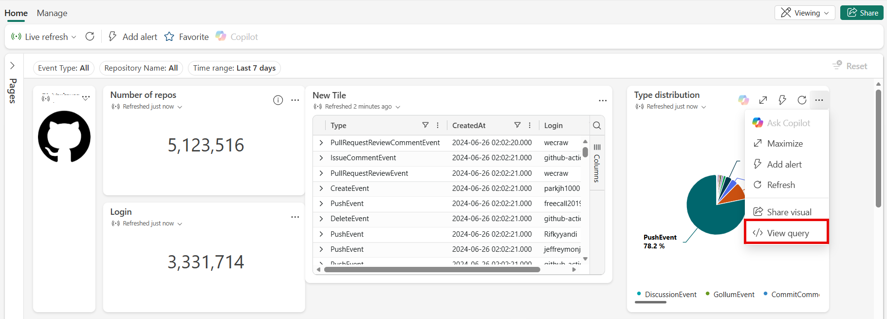
Select Edit in Queryset.
Choose either Existing KQL Queryset or New KQL Queryset. Proceed to edit the query in the KQL Queryset.

Note
Any edits you make to the query by using this flow don't appear in the original Real-Time Dashboard.

Enable live refresh
Live refresh is a feature that updates dashboard visuals when new data is ingested into the underlying source, without manually reloading the page or clicking a refresh button.
To enable live refresh for your dashboard:
Select the Manage tab > Refresh settings.
Select Live refresh to enable it.
Select values for Refresh rate limit and Fixed rate for non-supporting visuals.
Select Done and then Save the dashboard.


For more information about live refresh, see Live refresh in Real-Time Dashboards.
Share the dashboard
You can share Real-Time dashboards with others so they can access insights and visualizations without needing direct interaction with the underlying data sources. Sharing enables collaboration across teams by allowing users to view and interact with dashboard content through a link. This feature makes it easier to distribute monitoring views and analytical results. To successfully share Real-Time dashboards, ensure the recipients have the necessary Real-Time Dashboard permissions.
You can share an entire Real-Time Dashboard, or a specific visual.
To share the entire dashboard:
Select Share in the upper-right corner of the dashboard.

In Create and send link, complete the following steps:
- To see a link to the dashboard and copy it to the clipboard, select Copy link.
- To share a link to the dashboard via email, select by Email.
- To share a link to the dashboard via Teams, select by Teams.


To share a specific visual:
In the upper-right corner of a visual, select ... to open the visual's context menu.
Select Share visual.

Using the multiselect checkboxes, choose whether the shareable link should include the Link to open the visual in Fabric, the Visualization itself, and the Query that supports the visual.
Select Copy to copy the link to your clipboard.
Use dashboards in custom applications
In addition to sharing dashboards through links or collaboration tools, you can embed a Real-Time Dashboard in your own web application by using Fabric Embedded. This approach allows you to integrate real-time insights directly into your application, portal, or workflow.
For more information, see Fabric Embedded and Embedding quickstart.
Export dashboards
Use the file menu to export a dashboard to a JSON file. Exporting a dashboard can be useful in the following scenarios:
- Version control: Use the file to restore the dashboard to a previous version.
- Dashboard template: Use the file as a template for creating new dashboards.
- Manual editing: Edit the file to modify the dashboard. You can import the file back to the dashboard.
To export a dashboard, in the dashboard, select the Manage tab > |-> Download file.

The file contains the dashboard data in JSON format, an outline of which is shown in the following snippet.
{
    "id": "{GUID}",
    "eTag": "{TAG}",
    "title": "Dashboard title",
    "tiles": [
        {
            "id": "{GUID}",
            "title": "Tile title",
            "query": "{QUERY}",
            "layout": {
                "x": 0,
                "y": 7,
                "width": 6,
                "height": 5
            },
            "pageId": "{GUID}",
            "visualType": "line",
            "dataSourceId": "{GUID}",
            "visualOptions": {
                "xColumn": {
                    "type": "infer"
                },
                "yColumns": {
                    "type": "infer"
                },
                "yAxisMinimumValue": {
                    "type": "infer"
                },
                "yAxisMaximumValue": {
                    "type": "infer"
                },
                "seriesColumns": {
                    "type": "infer"
                },
                "hideLegend": false,
                "xColumnTitle": "",
                "yColumnTitle": "",
                "horizontalLine": "",
                "verticalLine": "",
                "xAxisScale": "linear",
                "yAxisScale": "linear",
                "crossFilterDisabled": false,
                "crossFilter": {
                    "dimensionId": "dragX-timeRange",
                    "parameterId": "{GUID}"
                },
                "multipleYAxes": {
                    "base": {
                        "id": "-1",
                        "columns": [],
                        "label": "",
                        "yAxisMinimumValue": null,
                        "yAxisMaximumValue": null,
                        "yAxisScale": "linear",
                        "horizontalLines": []
                    },
                    "additional": []
                },
                "hideTileTitle": false
            },
            "usedParamVariables": [
                "{PARAM}"
            ]
        }
    ],
    "dataSources": [
        {}
    ],
    "$schema": "https://dataexplorer.azure.com/static/d/schema/20/dashboard.json",
    "autoRefresh": {
        "enabled": true,
        "defaultInterval": "15m",
        "minInterval": "5m"
    },
    "parameters": [
        {}
    ],
    "pages": [
        {
            "name": "Primary",
            "id": "{GUID}"
        }
    ],
    "schema_version": "20"
}
Update or restore an existing dashboard from a file
You can update an existing dashboard or restore a previous version by using the following steps:
In the dashboard, select the Manage tab, and then select Replace with file.

Select the file to update the dashboard.
On the Home tab, select Save.