Note
Access to this page requires authorization. You can try signing in or changing directories.
Access to this page requires authorization. You can try changing directories.
Applies to: ✅ Power BI service
This article explains how to interact with reports and dashboards in the Power BI service to discover data-driven business insights. It focuses on the everyday tasks and tools available to Power BI business users (sometimes called consumers or readers). New to Power BI? See What is Power BI?
Note
Looking for navigation basics (Home, Browse, Apps, Learning center, workspaces)? Start with Getting around in the Power BI service. Need help locating content on the Home canvas? See Find content from Power BI service Home.
If you aren't signed up for the Power BI service, sign up for a free trial before you begin.
Prerequisites
Most interactions in this article assume:
- You have at least a Power BI Pro or Premium Per User (PPU) license, or the content you're viewing is stored in a Premium (or Fabric F64+) capacity that allows free users to consume it. Fabric (Free) users are limited to content in their own My workspace or Premium/Fabric capacity workspaces shared with them.
- Your Power BI or Fabric admin didn't disable the feature. Admins can turn off or restrict capabilities like export, Analyze in Excel, or Q&A for governance.
For details, see Power BI license types and service features by license.
Reading view
The Power BI service has two modes for working with a report: Reading view and Editing view. As a business user, you typically use Reading view to explore and interact with reports that others create and share with you. Report designers use Editing view to build reports.
Most reports open in Reading view. To switch to Editing view, select Edit from the action bar. If Edit is grayed out, you don't have permission to edit the report. To switch back, select Reading view.

Even in Reading view, the content isn't static. You can look for trends, explore insights, ask questions in natural language, set up alerts and subscriptions, and export or focus visuals—across devices.
Interactions at a glance
| Goal | Interaction | Learn more |
|---|---|---|
| Collaborate on a dashboard | Comments | Collaborate with colleagues |
| Get proactive updates | Subscriptions | Subscribe to a dashboard or report |
| Get notified when data crosses a threshold | Data alerts | Get alerts when your data reaches a threshold |
| Ask questions in natural language | Q&A | Use Q&A to ask questions using natural language |
| See underlying values | Tooltips, Show as a table | Display details on a visualization |
| Explore related visuals together | Cross-highlight, cross-filter | See how all the visuals on a page are interconnected |
| Narrow the data shown | Filters pane | Update the filters used in the report |
| Focus or present a visual | Focus mode, Full screen | Zoom in on individual visuals |
| Sort a visual | Sorting options | Sort a visualization |
| Reuse data elsewhere | Export, Analyze in Excel, PowerPoint | Export data to Excel |
For navigation basics and definitions of building blocks like reports, dashboards, and apps, see the links in the note earlier in this article. The rest of this article focuses on interaction techniques.
Interact in the Power BI service
Collaborate with colleagues
Skip the email. Add a personal comment or start a conversation with colleagues about a dashboard, right there on that dashboard. The comment feature is just one of the ways you can collaborate with others.

Learn more about commenting.
Tip
Commenting and other collaboration actions require Pro or PPU, or that the content resides in a Premium or Fabric capacity workspace that grants you access. See license types.
Subscribe to a dashboard or report
You don't need to open Power BI to monitor a dashboard. Instead, you can subscribe to it, and Power BI emails you a snapshot of that dashboard on a schedule you set.

Learn more about Power BI subscriptions.
Note
Subscriptions require a Pro or PPU license unless the content is hosted in a Premium capacity. Admins can disable subscriptions for governance or compliance.
Get alerts when your data reaches a threshold
Your data is live, and your visuals update automatically. If you want to get notified when data changes above or below a threshold you set, use data alerts. Alerts work on gauges, KPIs, and cards.
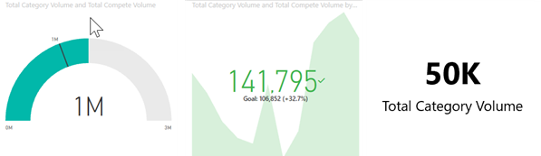
Power BI sends you an email when the value increases or decreases past the limit you set.

Learn more about Power BI alerts.
Important
Data alerts work only on certain dashboard tile types (KPI, gauge, card) and not on report visuals directly. They require at least a Pro license unless the dashboard is in a Premium capacity. Alerts also respect row-level security (RLS) and only evaluate data the user is authorized to view.
Use Q&A to ask questions using natural language
Sometimes the fastest way to get an answer from your data is to ask a question using natural language. The Q&A question box is available at the top of your dashboard. For example, "show me count of large opportunities by sales stage as a funnel."

Learn more about Power BI Q&A.
Tip
An admin or the dataset owner (semantic model) can limit or turn off Q&A availability. Some older dialogs might still display the term dataset instead of semantic model—the concepts are the same for the purposes of this article.
Display details on a visualization
Visuals are made up of data points, and by hovering over a data point, you can view the details.

Adjust the display dimensions
You can view reports on many different devices, with varying screen sizes and aspect ratios. The default rendering might not be what you want to see on your device.
To adjust, select the View icon from the upper right menu bar and choose one of the display options.

See how all the visuals on a page are interconnected
Cross-highlight and cross-filter the related visualizations on a report page. The visualizations on a single report page are all connected to each other. If you select one or more values in one visualization, other visualizations that use that same value change based on your selection.

Learn more about visual interactions.
Update the filters used in the report
Open the Filters pane to reveal the filters applied to the page, report, and visualization.

If the report has filters applied, they appear in the Filters pane. Make changes to the filters to see the effect on the visuals. Save your changes, or select the  to revert to the default report page state.
Zoom in on individual visuals
Hover over a visual and select the Focus mode icon.  . When you view a visualization in Focus mode, it expands to fill the entire report canvas.


To display that same visualization without the distraction of menu bars, filter pane, and other chrome—select Full screen from the View dropdown.


Learn more about focus mode and full screen mode.
Sort a visualization
You can sort visuals on a report page and save your changes.
Hover over a visual to make it active, and select More options (...) to open sorting options.

Learn more about sorting visuals.
Show the data used to create a visualization
Power BI builds visuals from data in the underlying semantic model. To see that data, make a visual active, select More options (...), and choose Show as a table. Power BI shows the data below or next to the visual.

Export data to Excel
You can export the data behind a visual and open it in Microsoft Excel. The export creates a separate spreadsheet; changes you make there don't affect the data in Power BI. For more information, see Export the data that was used to create a visualization.
You can also export entire reports to Excel or PowerPoint to share with colleagues. For more information, see Analyze in Excel and Power BI in PowerPoint.
Note
Your admin can disable the Export and Analyze in Excel features. Export respects security: row-level security (RLS), object-level security (OLS), and any applied filters or slicers at the time of export. Large exports are subject to service limits.