Muistiinpano
Tämän sivun käyttö edellyttää valtuutusta. Voit yrittää kirjautua sisään tai vaihtaa hakemistoa.
Tämän sivun käyttö edellyttää valtuutusta. Voit yrittää vaihtaa hakemistoa.
The map visualizations display results on a geographic map. The query result set must include the appropriate geographic data:
- Choropleth: Colors geographic localities, such as countries or states, according to the aggregate values of each key column. The query must return geographic locations by name (see Region lookup tables for supported names) or as a GEOMETRY or GEOGRAPHY column. For an example, see Choropleth map.
- Point map: Places a marker at a set of coordinates on the map. The query result must return latitude and longitude pairs or a GEOMETRY or GEOGRAPHY column. For an example, see Point map.
- Path map: Draws a line for each row from a GEOMETRY or GEOGRAPHY column. Use it for routes, transit lines, rivers, or borders drawn as lines. For an example, see Path map.
You can also render shapes from a GEOMETRY or GEOGRAPHY column instead of relying on predefined administrative boundaries or separate latitude and longitude columns. See Custom geographic data.
Choropleth options
A choropleth map colors geographic regions — such as countries, states, or counties — based on a numeric value in your data.
Configure a choropleth map
In the Data tab, click + Add SQL dataset, paste the following query, and run it:
Sample dataset
SELECT state, total_sales
FROM VALUES
  ('California', 98750),
  ('Texas', 87200),
  ('New York', 76300),
  ('Florida', 65100),
  ('Illinois', 54800),
  ('Pennsylvania', 48200),
  ('Ohio', 43500),
  ('Georgia', 41200),
  ('North Carolina', 39700),
  ('Michigan', 36100),
  ('New Jersey', 34800),
  ('Virginia', 32500),
  ('Washington', 31200),
  ('Arizona', 29700),
  ('Massachusetts', 28400),
  ('Tennessee', 26900),
  ('Indiana', 25100),
  ('Missouri', 23800),
  ('Maryland', 22600),
  ('Wisconsin', 21300),
  ('Minnesota', 20100),
  ('Colorado', 19400),
  ('Alabama', 18200),
  ('South Carolina', 17600),
  ('Louisiana', 16900),
  ('Kentucky', 15800),
  ('Oregon', 14700),
  ('Oklahoma', 13600),
  ('Connecticut', 12500),
  ('Utah', 11900),
  ('Iowa', 11200),
  ('Nevada', 10800),
  ('Arkansas', 10100),
  ('Mississippi', 9600),
  ('Kansas', 9200),
  ('New Mexico', 8700),
  ('Nebraska', 8300),
  ('West Virginia', 7900),
  ('Idaho', 7400),
  ('Hawaii', 7100),
  ('New Hampshire', 6800),
  ('Maine', 6400),
  ('Montana', 6100),
  ('Rhode Island', 5800),
  ('Delaware', 5400),
  ('South Dakota', 5100),
  ('North Dakota', 4800),
  ('Alaska', 4500),
  ('Vermont', 4200),
  ('Wyoming', 3900)
AS t(state, total_sales);
In the visualization editor, configure the following:
- Set the visualization type to Choropleth map.
- In the Region section, under Country, click
 . Under Values, click Select a country and select United States.
 - In the Region section, under State/Province, click . Under Fields, select
state. - Under Color, click , select
total_sales, and set the transform to SUM.

Region
The Region setting tells the map how to interpret the location values in your data. Choose the format that matches your data. Databricks supports administrative boundaries, postal codes, US Census statistical areas (CSA and CBSA), US legislative districts, and EU NUTS regions. For the levels available under each format, along with the names, abbreviations, or codes they accept, see Region lookup tables.
If a value in your location column doesn't match the selected format, no data is shown for that region.
Alternatively, select Custom geometry to render region boundaries directly from a GEOMETRY or GEOGRAPHY column in your data. See Custom geographic data.
Color
Colors populate automatically for each region that has data. Click the color swatch to choose a different color.

To color regions by a numeric field, click in the Color section and select a field. You can apply a transformation such as SUM or MEDIAN. The map applies a color gradient across the range of values. To customize the colors, gradient, and labels, click the color swatch.
Region lookup tables
Find the section that matches your Region setting and download its lookup table to check which names, abbreviations, or codes are supported.
Administrative
| Level | Lookup table |
|---|---|
| Country | country-names.csv |
| State/Province | state-province-names.csv |
| County/City | county-district-names.csv |
| Town/Township | town-names.csv |
| City/Village | city-village-names.csv |
Note
For admin-0 (country) boundaries, you can use English names from the name_en column directly as the identifier in your query. For other region levels, use the name_en column to look up supported values, but use one of the other columns as the identifier in your query.
Postal
ZIP or postal codes use zipcode-codes.csv.
CSA / CBSA
CSA (Combined Statistical Areas) groups adjacent metropolitan and micropolitan areas with economic ties. CBSA (Core Based Statistical Areas) covers individual metropolitan and micropolitan areas.
| Level | Lookup table |
|---|---|
| Combined Statistical Areas | us-csa-codes.csv |
| Core Based Statistical Areas | us-cbsa-codes.csv |
Legislative
| Level | Lookup table |
|---|---|
| State senate districts | senate-names.csv |
| Congressional districts | congressional-district-codes.csv |
NUTS
NUTS is the EU Nomenclature of Territorial Units for Statistics, with three levels: NUTS 1 (major socioeconomic regions), NUTS 2 (basic regions for regional policy), and NUTS 3 (small regions for specific diagnoses).
| Level | Lookup table |
|---|---|
| NUTS 1 | eu-nuts-1-codes.csv |
| NUTS 2 | eu-nuts-2-codes.csv |
| NUTS 3 | eu-nuts-3-codes.csv |
Point map options
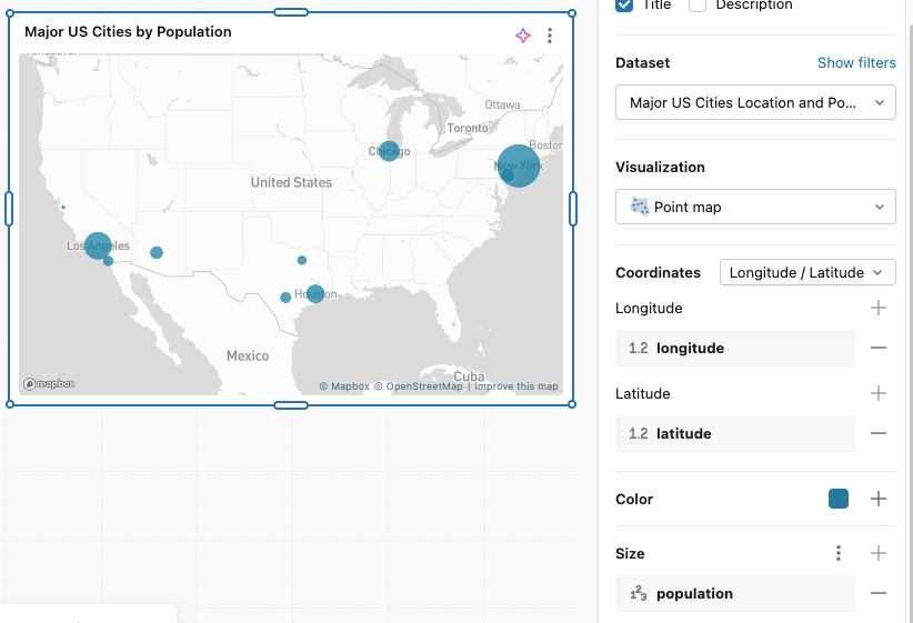
A point map places a marker at a set of coordinates for each row in your data.
Configure a point map
In the Data tab, click + Add SQL dataset, paste the following query, and run it:
Sample dataset
SELECT city, latitude, longitude, population
FROM VALUES
  ('New York',     40.7128,  -74.0060, 8336817),
  ('Los Angeles',  34.0522, -118.2437, 3979576),
  ('Chicago',      41.8781,  -87.6298, 2693976),
  ('Houston',      29.7604,  -95.3698, 2320268),
  ('Phoenix',      33.4484, -112.0740, 1608139),
  ('Philadelphia', 39.9526,  -75.1652, 1603797),
  ('San Antonio',  29.4241,  -98.4936, 1434625),
  ('San Diego',    32.7157, -117.1611, 1386932),
  ('Dallas',       32.7767,  -96.7970, 1304379),
  ('San Jose',     37.3382, -121.8863, 1013240)
AS t(city, latitude, longitude, population);
In the visualization editor, configure the following:
- Under Coordinates, select Longitude/Latitude.
- Under Longitude, click and select
longitude. - Under Latitude, click and select
latitude.
- Under Longitude, click
- Under Size, click and select
population.
Coordinates
Use the visualization editor to configure the Coordinates:
- Longitude/Latitude: Choose the column that contains the Longitude and Latitude components of the map coordinates.
- Geometry: Select a GEOMETRY or GEOGRAPHY column to use as the point location instead of separate latitude and longitude columns. See Custom geographic data.
Color
For ungrouped data, click the color swatch to change the point colors shown on the map. To apply a grouping strategy, click in the Color section of the visualization editor. You can adjust the automatically assigned colors by clicking the color swatch next to each group label in the editor.
Size
Click in the Size section to choose a field that reflects quantity. This lets you display dots of varying sizes based on the data value.
Path map options
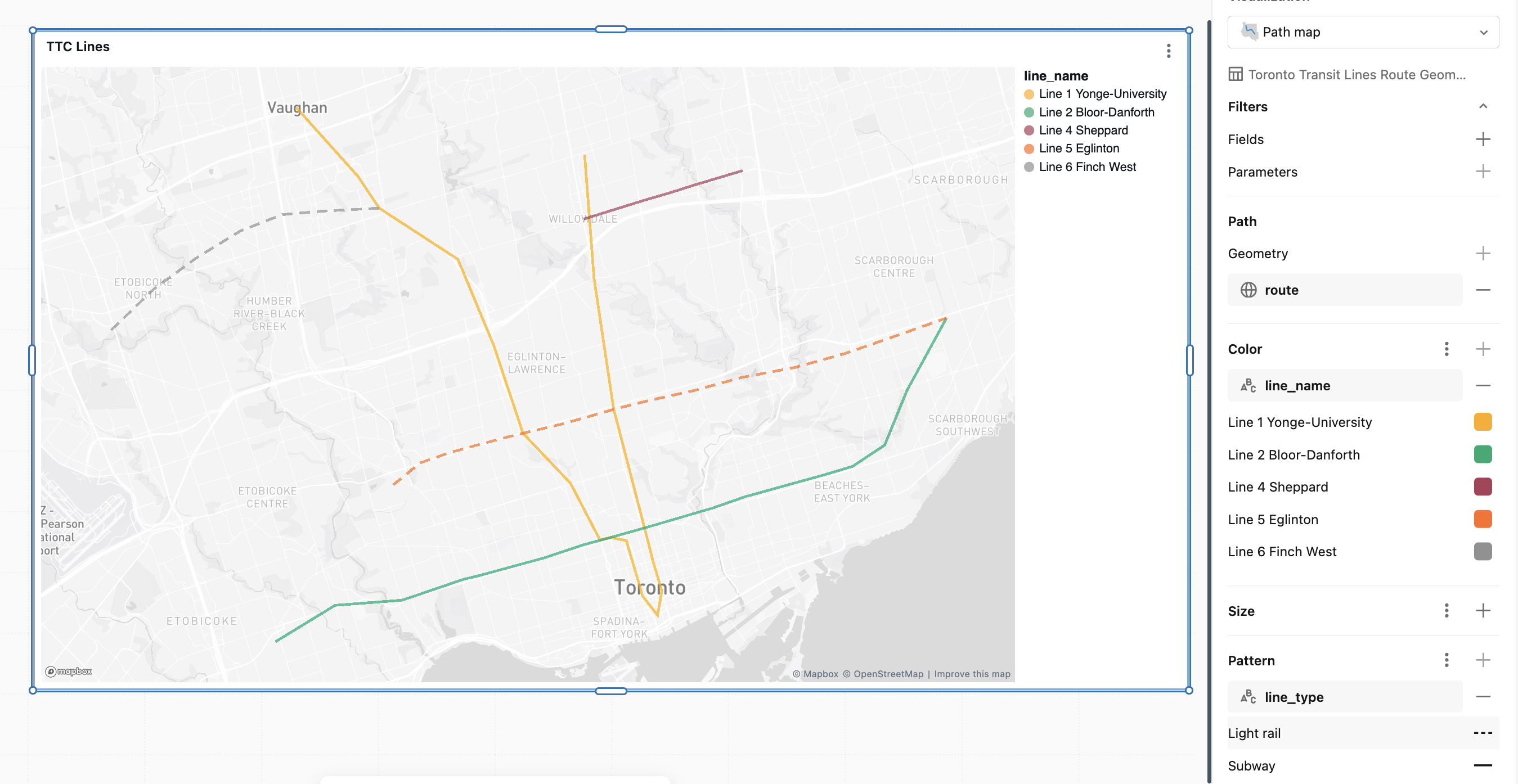
A path map draws a line for each row in your data from a geometry column.
Configure a path map
In the Data tab, click + Add SQL dataset, paste the following query, and run it:
Sample dataset
SELECT line_name, line_type, ST_GEOMFROMTEXT(wkt, 4326) AS route
FROM VALUES
  ('Line 1 Yonge-University', 'Subway',     'LINESTRING(-79.4103 43.7804, -79.4065 43.7442, -79.3985 43.7057, -79.3860 43.6709, -79.3826 43.6612, -79.3790 43.6524, -79.3807 43.6453, -79.3868 43.6509, -79.3884 43.6549, -79.3934 43.6672, -79.3998 43.6681, -79.4041 43.6674, -79.4160 43.6840, -79.4353 43.6987, -79.4473 43.7247, -79.4617 43.7497, -79.4936 43.7647, -79.5022 43.7740, -79.5273 43.7942)'),
  ('Line 2 Bloor-Danforth',  'Subway',     'LINESTRING(-79.5357 43.6375, -79.5115 43.6482, -79.4843 43.6497, -79.4595 43.6558, -79.4526 43.6570, -79.4263 43.6622, -79.4111 43.6659, -79.3998 43.6681, -79.3860 43.6709, -79.3585 43.6767, -79.3450 43.6801, -79.3126 43.6866, -79.3016 43.6890, -79.2886 43.6952, -79.2795 43.7113, -79.2635 43.7325)'),
  ('Line 4 Sheppard',        'Subway',     'LINESTRING(-79.4106 43.7615, -79.3866 43.7669, -79.3762 43.7691, -79.3661 43.7714, -79.3462 43.7757)'),
  ('Line 5 Eglinton',        'Light rail', 'LINESTRING(-79.4880 43.6835, -79.4770 43.6900, -79.4650 43.6930, -79.4540 43.6952, -79.4420 43.6975, -79.4353 43.6987, -79.4190 43.7015, -79.4090 43.7035, -79.3985 43.7057, -79.3830 43.7085, -79.3660 43.7112, -79.3470 43.7150, -79.3250 43.7180, -79.3050 43.7220, -79.2850 43.7270, -79.2635 43.7325)'),
  ('Line 6 Finch West',      'Light rail', 'LINESTRING(-79.4936 43.7647, -79.5170 43.7638, -79.5330 43.7628, -79.5500 43.7580, -79.5680 43.7500, -79.5850 43.7410, -79.6030 43.7285)')
AS lines(line_name, line_type, wkt);
In the visualization editor, configure the following:
- Set the visualization type to Path map.
- Under Path, next to Geometry, click and select
route. - Under Color, click and select
line_name. - Under Line pattern, click and select
line_type.
Geometry
Select a GEOMETRY or GEOGRAPHY column that contains the line geometry to draw. Each row is drawn as one line. Unlike a point map, a path map doesn't accept separate latitude and longitude columns. See Custom geographic data.
Color
For ungrouped data, click the color swatch to change the line color shown on the map. To color lines by a field, click in the Color section and select a field. You can adjust the automatically assigned colors by clicking the color swatch next to each group label in the editor.
Size
Click in the Size section to choose a numeric field that varies line thickness based on the data value.
Line pattern
Click in the Line pattern section to choose a categorical field that varies the dash style of each line.
Custom geographic data
You can render maps directly from a GEOMETRY or GEOGRAPHY column in any dataset. Use this to visualize custom shapes such as sales territories, school districts, and store catchment areas, or to plot points without splitting coordinates into separate latitude and longitude columns.
The map draws each row independently, so shapes or points can overlap if your data has multiple rows per region. To combine rows into a single shape per region, use a geometry measure in a metric view. See Limitations and Local metric views.
Define a metric view with a geometry measure
In your metric view YAML, set the geometry or geography column as a measure using one of the supported aggregations: ST_UNION_AGG, ST_ENVELOPE_AGG, FIRST, or LAST. Use dimensions for the non-geometry columns you want to group by.
The following local metric view defines region as a dimension, total_sales as a numeric measure, and uses ST_UNION_AGG to combine per-row boundaries into a single shape per region:
version: 0.1
source: sales.territories

dimensions:
  - name: region
    expr: region

measures:
  - name: total_sales
    expr: SUM(sales_amount)
  - name: region_shape
    expr: ST_UNION_AGG(boundary)
If your geographic data is stored as a serialized string or binary value, cast it to GEOMETRY or GEOGRAPHY in the measure expression.
Create a choropleth map
Choropleth maps support Polygon and MultiPolygon shapes.
- Add the metric view as a dataset.
- Set the visualization type to Choropleth map.
- Under Region, select Custom geometry and select your geometry measure (for example,
region_shape). - Under Color, select a numeric measure such as
total_sales.
Create a point map
Point maps support Point and MultiPoint shapes. Use a Point-valued geometry measure such as FIRST(location) or ST_UNION_AGG(location).
- Add the metric view as a dataset.
- Set the visualization type to Point map.
- Under Coordinates, select Geometry and select your geometry measure.
- Optional: Under Size, select a numeric measure to vary point sizes.
Create a path map
Path maps support LineString and MultiLineString shapes. Use a LineString-valued geometry measure, or combine per-row segments into a single path per group with ST_UNION_AGG.
- Add the metric view as a dataset.
- Set the visualization type to Path map.
- Under Path, select your geometry measure.
- Optional: Under Color, select a field to color the lines.
Limitations
Custom geographic data has the following limitations:
GROUP BYisn't supported onGEOMETRYorGEOGRAPHYcolumns. To combine multiple rows into a single shape per group, aggregate geometry as a metric view measure usingST_UNION_AGG,ST_ENVELOPE_AGG,FIRST, orLAST. Otherwise, each row is rendered independently and shapes may overlap.- The map renderer uses WGS84 (
SRID 4326). Databricks reprojectsGEOMETRYcolumns in other SRIDs automatically;GEOGRAPHYcolumns must already beSRID 4326. Use ST_Transform in your measure expression to reproject if needed. GEOMETRYcolumns withSRID 0(unknown coordinate system) aren't rendered.GeometryCollectionvalues and columns that mix multiple shape types aren't supported.- Label encodings aren't supported on maps that use a geometry or geography column.